

These days, UX works more like big software companies like Google, Meta, etc. operate, where they're improving their platform, including the front-end of that platform, for all of their users through releases. This way, we're not building improvements in a silo for one client and needing to rebuild them for another. Instead, they become configurations on our platform that can be turned on for any client that has the need, and in some cases, that has the content assets to do so.
Here are a few key UX releases we’ve worked on in the last year, and how various UX principles have come into play.
1. Splitview razor toolbar
Splitview was designed to have the left and right panes independently scroll against the header. But as more clients joined our platform, we found they had different header requirements. The leaderboard ad became a really significant factor in increasing the heights of the headers, which reduced the area below for users to read and interact with the content.On some sites, the header is streamlined and thin enough that it works. But for others, we've designed this alternative experience for Splitview that can be turned on via configuration, where the user can scroll past the header area, and the toolbar will stick instead of the header. Since the toolbar is much thinner, it provides a lot more reading area below it.
Our research shows that scholarly researchers really like the splitview reading experience. They're spending a lot of time in the left pane reading the text and interacting with the figures, tables, and related content in the right pane.
This experience provides a lot more affordance for researchers. Affordance is providing the size and space needed to for a user to interact with a component on a site. So if you've ever had a really hard time closing an ad on mobile with the small x, that's really bad affordance.
2. EPUB / PDF reader
The EPUB / PDF reader allows users to read EPUB and PDF files directly online on the site, versus having to download them and open them in another program. This creates more user stickiness on the site, encouraging the user to go from here and search and discover some other related content. 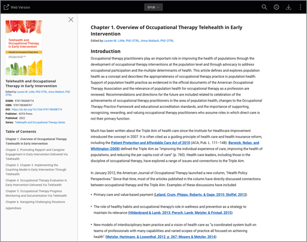
We designed the reader to have a minimal user interface (UI), similar to a magazine-type reading experience. The reader features streamlined headers and a left rail that can be expanded and collapsed.
We wanted to reduce users’ cognitive load, which means that the more the user needs to use their brain, the more taxing an experience is. The more energy they expend in navigating the site, the less energy they have to consume the content that they want.
3. Standalone multimedia
This new feature allows users to search and discover multimedia as a first-class content type similar to articles and chapters. In designing this feature, we wanted standalone multimedia to have a consistent display with those other kind of research artifacts, to maintain overall product consistency. This content also has all of the needs of an article in terms of metadata, abstract content, caption content. 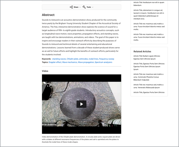
We wanted to maintain the scanability of the page and not bury the multimedia, say, in a modal. There's a tenet from the Nielsen Norman Group that I think is very true: users don't read, they scan. Most users are going to scan a page before they actually commit the energy and the time to read the text. For example, we want a user to be able to go check out a video and decide if they really want to commit their time to all of the content on the page.
4. Peer review
This feature allows users to read the peer review history of an article, like decision letters, author responses, etc. We wanted to integrate this content into the articles themselves and not be at their own URL where a user might have to have two browser tabs open. So, on standard view, they appear in the body of the page. And on splitview they appear in the right pane in their own tab. This content can be pretty lengthy, so we put them in expand / collapse components in the right pane so users can scan and decide if they want to open them.This comes from the UX concept of Hick's Law: the more time something takes for a user to decide to do an action, the more energy they expend, and the worse user experience they come away with. So we want to honor the content and the complexity of the content while reducing any friction, cognitive load or, in this case, the precious time that users value so much.
Which leads to my final section on product features that are not visible like buttons and headers, but really do impact user experience.
5. Non-functional requirements
Here I want to highlight a few non-functional requirements (NFRs) that are the most important to user experience.Security: I bet all of us have had that experience of opening a site and getting the browser saying, this is not a secure site, go back. This is obviously a bad, if not scary, user experience. Silverchair has a security team that's constantly monitoring for abuse of our sites, staying on top of things like security certificates, and generally scanning for bad actors. With the capabilities of AI, this is going to become increasingly important for us to invest time and resources into because the technology's constantly advancing and not everyone on the web is using it for good reasons.
Performance: This might be the biggest one. I know that if I open a web page (and I feel like this happens on recipe blogs all the time) and a video ad opens and other sticky ads open, and the browser's just choking on the page, I just abandon the site and I'm going to go find the same recipe someplace else. We don't want that to happen on our publisher sites. We don't want users to abandon sessions over bad page performance. We have numerous tools to monitor client sites’ page load times, and our architecture team just did a big audit and remediation effort with our scrum teams.
With the technology advancing, our expectations for page performance are increasing exponentially. Users expect pages to load if not instantly, then under a second – maybe even half a second. So this is something that we want to continue to invest in and that is super important for user experience.
Accessibility: Obviously, accessibility does have a visual front-end component, but we usually think of accessibility as people who use assistive technology devices like screen readers. And, certainly, improving accessibility is hugely important for those users. But I think as the technology-savvy generations age, we're all going to be in need of some form of accessibility. Even if we're not using screen readers, we're going to want to use things like keyboard operability because we might have some carpal tunnel pain, or text magnification for fading eyesight.
If you think about the aging population and how accessibility affects that number of people, it's a vast global number. Silverchair has an ongoing backlog of accessibility remediation work, and we've put a lot of effort into it the last few years. That said, this space will continue to evolve, which is why we’ve worked to build accessibility into our development cycle, and are about to release an accessibility guide to our publishers to help them make sure the content and self-serve changes on their side are also AA compliant.
The shift from flashy bespoke front-end designs to a focus on underlying UX, performance, and accessibility over the last decade will no doubt be mirrored in furthered shifts in the next decade. This is why user-centered design and research continue to be the foundation of UX, helping us deliver the experiences users want while achieving the needs of the publishers we serve.